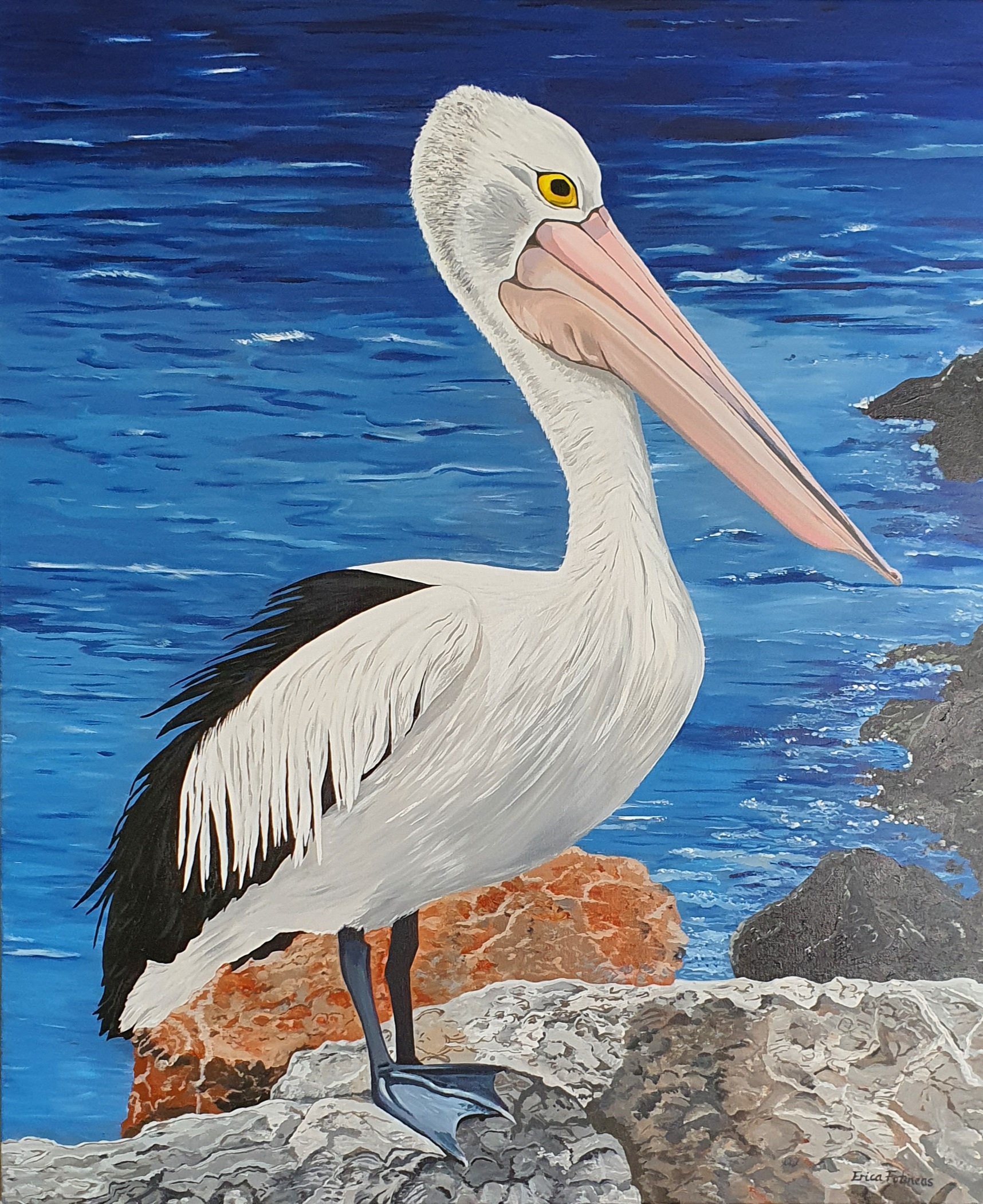
I recently painted a pelican (Mr Proud) who is standing ‘proudly’ of course, in front of a deep ocean backdrop. When you look closely at the ocean there are many different blues. So how do you define the predominant paint color to use?
Southern Hemisphere ocean color
In Australia, the ocean colors vary from turquoise tropical waters in Queensland to deep blues of the Great Australian Bight. For the rich deep blue of Mr Proud, I used Phthalo Blue, with a touch of Ultramarine Blue.
If you want to brighten the blue, you can try adding Cerulean Blue. This one is lighter than Phthalo so it is useful for more shallow water without trending towards a tropical turquoise.

Deep ocean blue on a wintery day
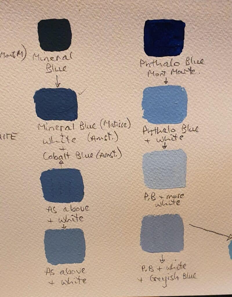
When your ocean painting has an overcast, grey tone to it, try Matisse Mineral Blue. It has a definite greyish and more sombre appearance than the bright, vivid Phthalo Blue.
By adding cobalt blue to Mineral Blue you will achieve something more like a mid-denim blue. Sometimes it is easier just to add white for more shallow water.
Amsterdam have made a color called Greyish Blue. This is perfect to create that cloudy Winter ocean scene. Utilise the color in the ocean as you mix it with deeper blues, but also for tinting the clouds, and creating a moody sky. However, check that Amsterdam works well with your other paint brands first.

Deep ocean waves
To provide the deep, darkness of ocean waves try using Prussian Blue to provide the shadow of the wave. Sunlit water in the crest of a wave is always lighter and contains a small element of green. This is where Cerulean blue may be utilised. For a mid Summer ocean with high waves, consider using Southern Blue Ocean with varying additions of Titanium white. If your painting is particularly bright, you can also experiment with Cobalt Blue.
Beware of same name, different colors!
Always spend some time creating a labelled color palette before you start. It is an extremely useful reference point and can be utilised for future paintings as well. Make sure you identify the brand of paint.
For example Matisse colors are quite different to Amsterdam. Mont Marte colors are also quite different, and yet they may carry the same name.
Check whether the effect is equally satin, or if one is more matte. This can effect the over-all consistency of your painting.


