
As a long term acrylic painter, I became a novice again when I attended oil painting classes at the Adelaide Hills Art Academy in Crafers, South Australia.
Immediately I was struck with the difference in the quantity of paint placed onto my palette.
I feel almost reckless the way I place such a large amount of acrylic paint onto a palette in comparison to what I did with oils.
The thing with acrylic paint is you want enough of the right color before it starts drying out. That means you can’t be stingy with the paint.
Oils are richly pigmented, a little goes a long way and importantly: they don’t dry quickly. The time factor allows you to work longer at blending and layering.
How Much Oil Paint On Your Palette?
When I squeeze out my oil paint, it is done carefully and minimally in a consistently repeated pattern that never changes on my palette, no matter what my subject matter is.
Starting on the left:
Lemon Yellow first (cool), Cadmium Yellow next (warm), Cadmium Orange, Cadmium Red, Crimson Alizarin, Pthalo Blue, Ultramarine Blue.
Then in their own special spots away from the other colors are Titanium White and Ivory Black.
Incredibly to me, I could mix an amazing array of colors from this basic row of oils that precisely met my requirements.
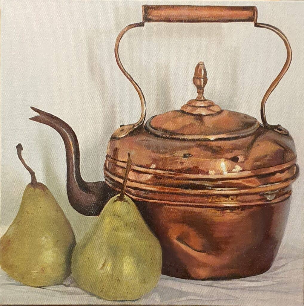
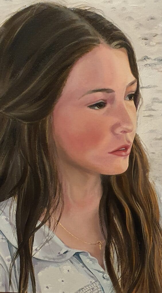
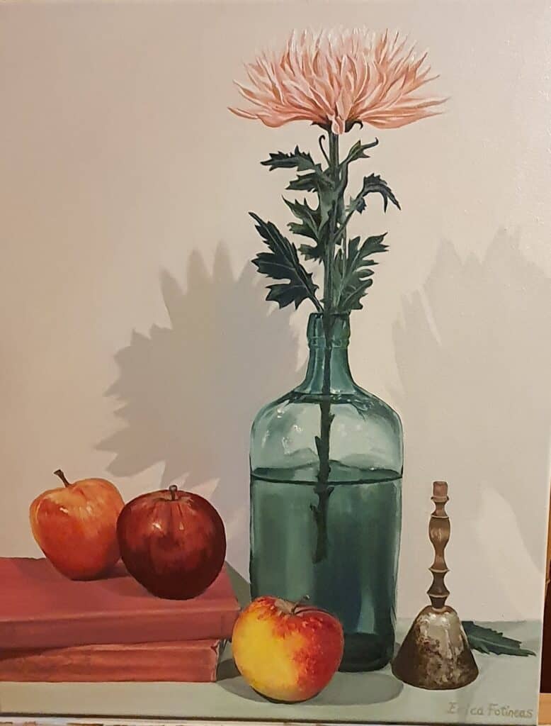
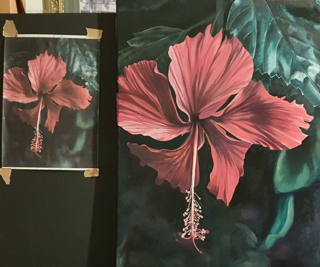
I used this same palette for a portrait of my grand-daughter Gracie, a copper kettle and green pears, a red rose, an orange-red hibiscus and a still-life green bottle and rusty metal bell.
Secondary Color Choices For Oils
Occasionally I added Raw Umber or Burnt Sienna. And Pyrrole Red or Quinacridone Red (very strong and vibrant).
I thought I would have to gradually buy the huge range of colors that I own in acrylics. Happily I discovered that this is not necessary.
Learn the skill of mixing, use a color wheel or chart if you haven’t got a teacher.
Other colors are always available, but as oils are so expensive you may find that your basic palette is amazingly sufficient if you mix correctly.
Oil Colors Versus Acrylic Colors
During my oil painting class a few weeks ago, I complained to my teacher Trevor Newman (who is an amazing Australian artist), that I could not get my exact rose petal color.
No matter how I tried to mix my reds, I couldn’t get the vibrant, almost magenta red that I was after where the sunlight hit the petals. Then he dropped the bombshell:
Acrylic paint is better for some of the profound irredescent colors as there is a much greater array of color choice in the acrylic paint range!
I did not expect that. But then he showed me how to create the illusion of color using the oils I had. As he said: by using color, tone and value, you can achieve anything.
The illusion is created by the value and contrast of the opposing colors in the composition.
The skill of an oil painter is that they have become incredibly adept at getting the color match correct. (And this is also true of an acrylic artist who mixes their own colors instead of buying from the huge range of pre-mixed.)
Which Color Is Pure Magic On Your Palette?
Cadmium Orange is indispensable. What an amazing mixer this one is, but only the tiniest amount.
It creates the zing in a red petal, and holds a suggestion of sunlight and brightness like nothing else.
Cadmium Orange adds life to a portrait, coppery highlights to hair, and warmth to any other color it touches.
Be wary with it though, because a tiny bit goes a long way.
Cadmium Orange gives a perfect grey by adding a touch to Ultramarine Blue and Lemon Yellow.
It is worth experimenting with, and I would always have it on my basic oil palette now.
Clean up and Thinning Oil Paint
The other obvious difference between oils and acrylics is the addition of special clean-up and thinning products.
I used Langridge Low Toxic Solvent as a clean-up, and Langridge Low Toxic Paint Medium to thin.
You don’t need much at all, so don’t think you will need as much as the amount of water used with acrylic paints, it is not like that.
Finally after you have cleaned your brushes initially with the solvent, use Chroma Incredible Brush Cleaner. This is exactly as it claims to be: incredible.
For a final deep clean, I use Sard Wonder Soap and water. It works to remove staining of your brush and they come out silky soft with no residue left at all.
This is a very simple introduction to Oil painting, but I hope it was enough to inspire you to give it a try.